
Case study for Benchmark pages
Note:
- All filters are applied to all graphs of your dashboard. Please keep this in mind when doing your analysis. You can filter by channel (print, online, social), date and country.
- All graphs are clickable, when clicking you will get a view of the top 10 placements for the scope analyzed in the graph (specific date, voice type, etc).
- All graphs are available to download in excel
Overview rankings
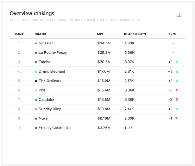
This table shows the ranking of each brand by MIV and ranking evolution for the period, channel type and country selected in filters.
Share of Value
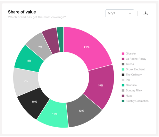
This donut chart shows the percentage of MIV generated by a brand during the period and for the channel and country selected in filters. You can see it in MIV or in Placements. Base 100 sum of all competitive brands in tenant
Tip: By assigning a monetary value to each of your competitors’ activities, you can estimate what return a campaign could bring to your brand and use this data as insights into the market you operate in.
Global MIV Evolution
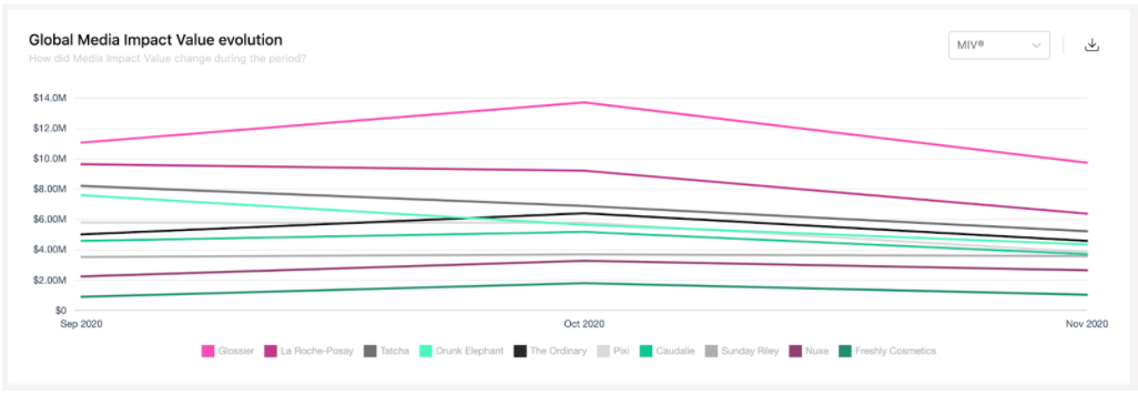
This line chart shows the evolution of MIV on the period selected in filters, for each brand. By clicking on the brand name in the legend you can hide it on the graph. You can see it in MIV or in Placements.
If you select 2 months or less, data is displayed day per day. If you select more than 2 months, data is displayed month per month.
Analysis tips : Here it's interesting to analyze the impact of an event/campaign on the timeline. It can also be interesting to use the on-clic to understand which placement brought a spike. The beginning of the month is usually higher than the rest because most of Print is accounted for at this time.
Voice mix benchmark
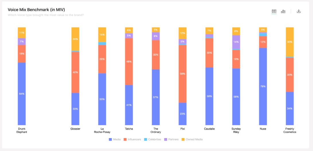
This bar chart displays an aggregation of MIV per Voice type. You can see it in MIV or placements.
Analysis tips : Celebrities often bring a bigger proportion of the MIV than the placement because they bring a lot of MIV/placement.
You can use this chart to detecting strengths of competitors to better define a differentiating strategy or opportunities. For example, in Fashion and more traditional sectors, media is still often very strong. In Beauty however, it will be more focused on influencers.
Note:
- If an influencer writes an article for a media it will be stored under media - we only focus on the source publishing the content.
- If a media talks about a celebrity, it will be stored under media.
- Each piece of content can have only one voice type.
Channel mix benchmark
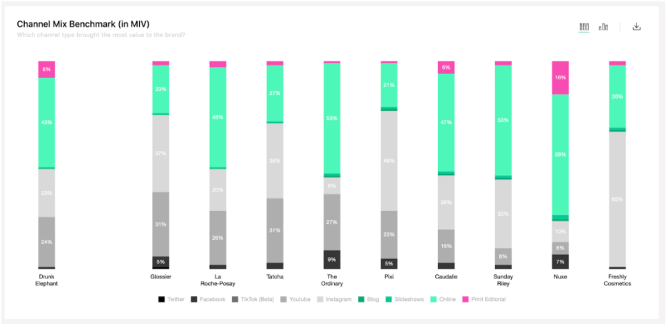
This bar chart presents an aggregation per channel. You can see it in MIV and placements next to each other.
Channels that are available are : Print editorial, Online media, Blogs, Slideshows, Instagram, Youtube, Facebook, Twitter and TikTok.
Analysis tips : Some channels often bring more value with less placements (Youtube, Print...).
Brand efficiency
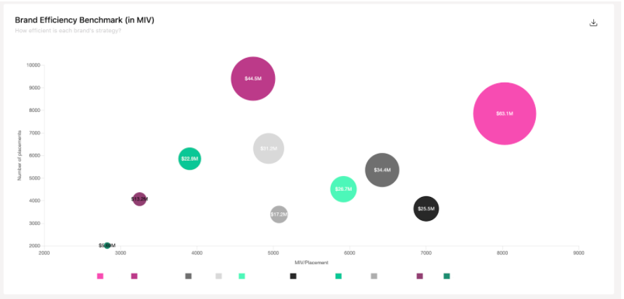
X axis is the average MIV/placement (=quality of coverage), Y axis is the number of placements (=quantity of coverage), while the size of the bubble shows the total MIV generated by the brand.
Analysis tips: There is no good or bad position in this graph. It all depends on your brand's strategy: is it more focused on quantity even if it comes from small influencers and less influential media? Is it a niche brand focused on high end media and very big and well-known influencers?
This graph can be interesting for Owned media to see the efficiency of your content strategy on your followers.