Step By Step Guide
New concepts for Beta Galleries are the Library & Showroom and their definitions are as follows:
- A Library is internal facing and it is for you to manage and store your digital assets - past campaigns, collections. Essentially a digital archive for all your digital content (videos and images).
- A Showroom is where you can build a beautifully curated collection of images and videos to share with your customers, press, etc so they can explore more about your collection.
This article will cover the creation of your Showroom. If you want to learn more about creating your Library please click here .
Step 0 (Client or LM Side): Choose a Logo for your showrooms
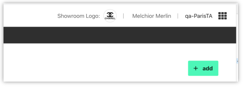
Before creating your library or showrooms, it is a good idea to initialize the logo that will be used in all your showrooms. Click on the default Galleries logo that appears in the header of the application, and upload one from your computer.
Try to select a high-quality image, in a horizontal format preferably. The logo will be displayed over a white background, so if you have a light and a dark version, choose the dark version of the logo.
Step 1: Initialize your first Showroom
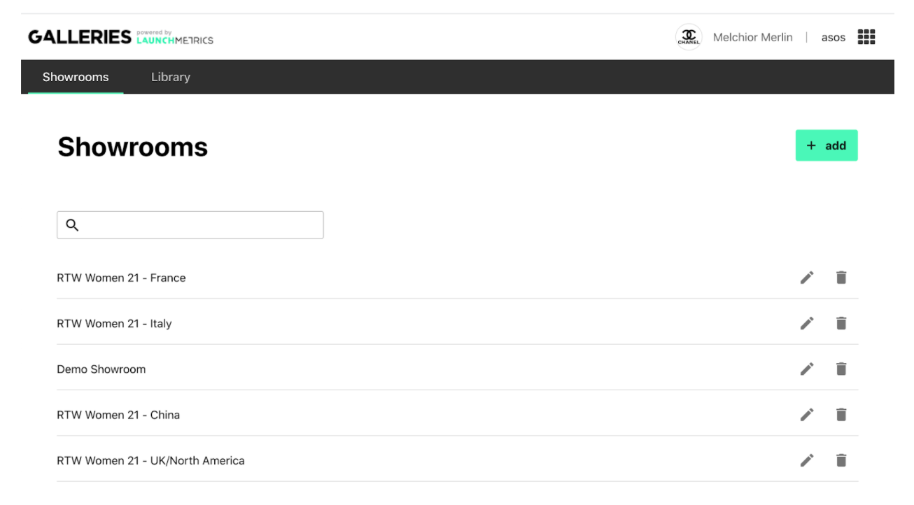
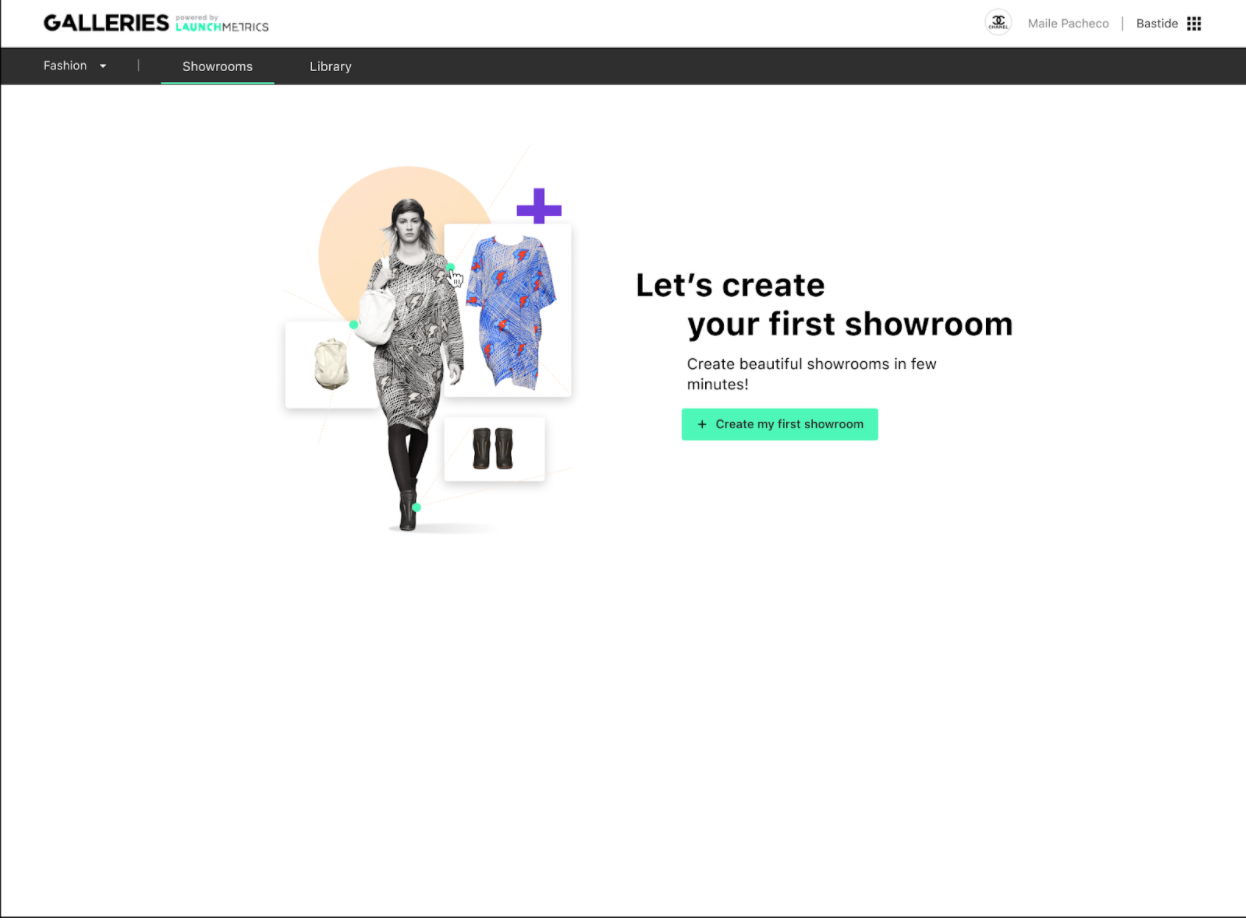
Start by clicking on the 'Showrooms' tab in the top left of the app. (note that you couldn’t click it before, not until you had created your Library structure). Click on “Create your first Showroom”
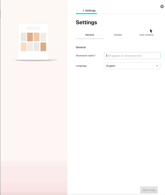
Now we’ll set up the general settings. Give your Showroom a name (for internal reference only, it won’t be shown to users), and choose which language applies to it.
This will change the language of the buttons & interface of the Showroom itself (for downloading media, for example). As of now, you can only have one language per Showroom. This is to allow you to personalize your Showroom for different countries, with the same media but with different organizations/layouts, etc., so as to cater to your local market.
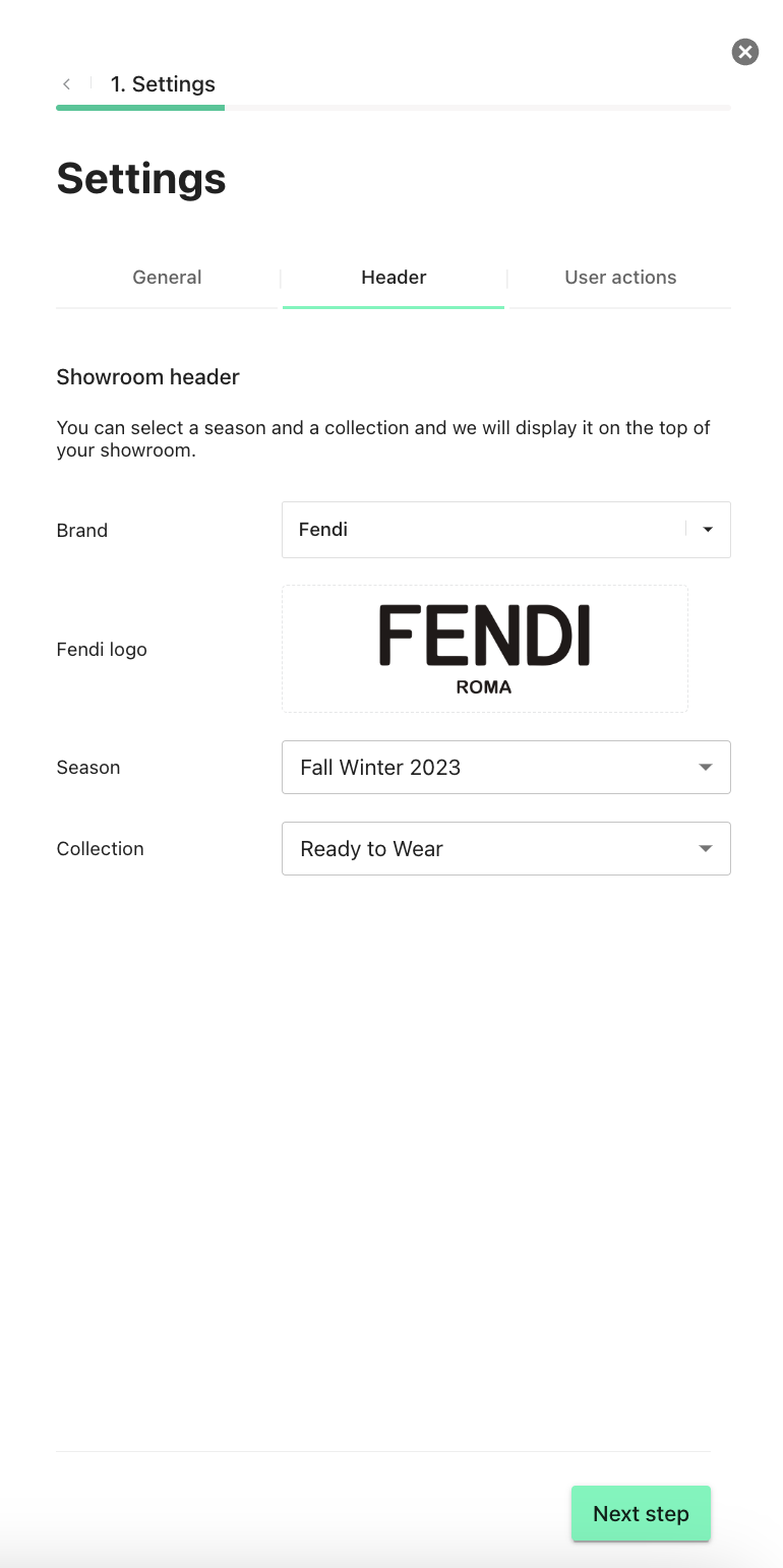
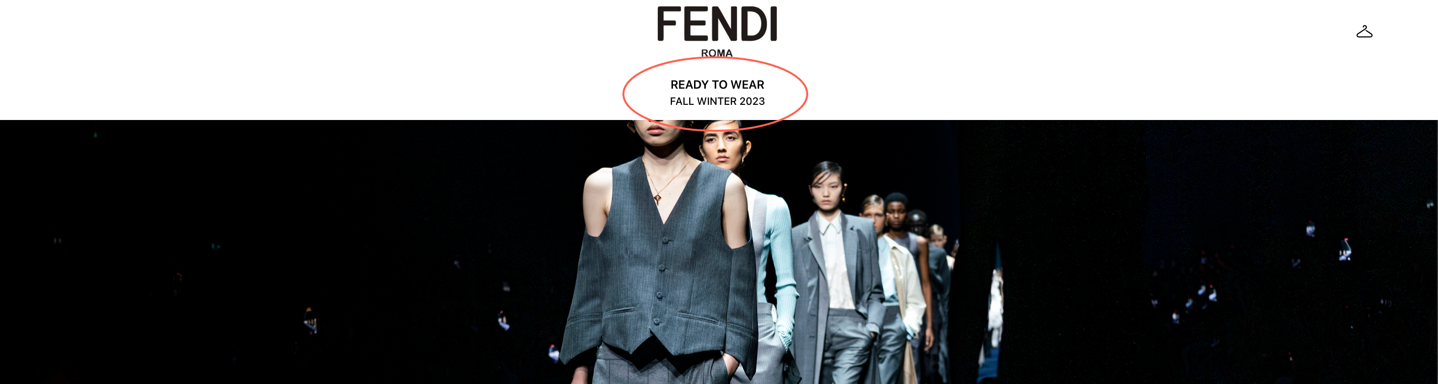
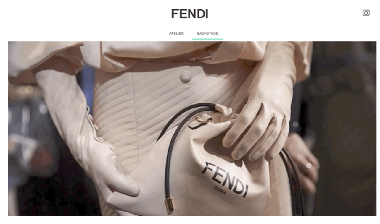
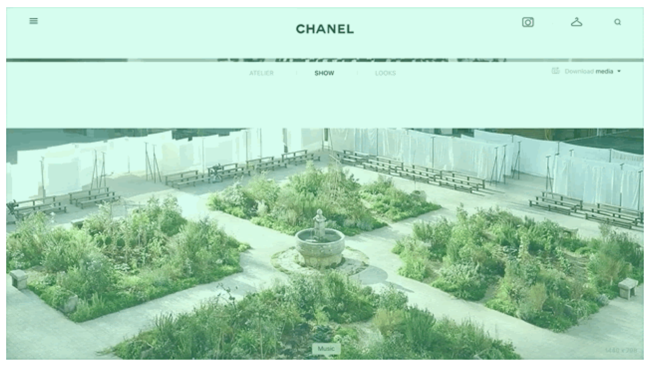
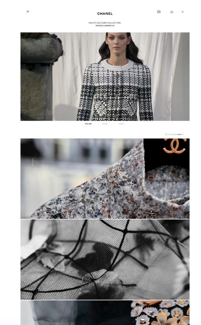
Next, set up the look of your header by clicking on “Header” in the top of the page: your logo, and the title and subtitle of your Showroom, which are based on the season and collection that you select here. Alternatively, you can leave one or both of these drop-downs blank, and your Showroom will just not have a subtitle or will have neither title nor subtitle.
Next, you can choose what actions are available for visitors to your Showroom.
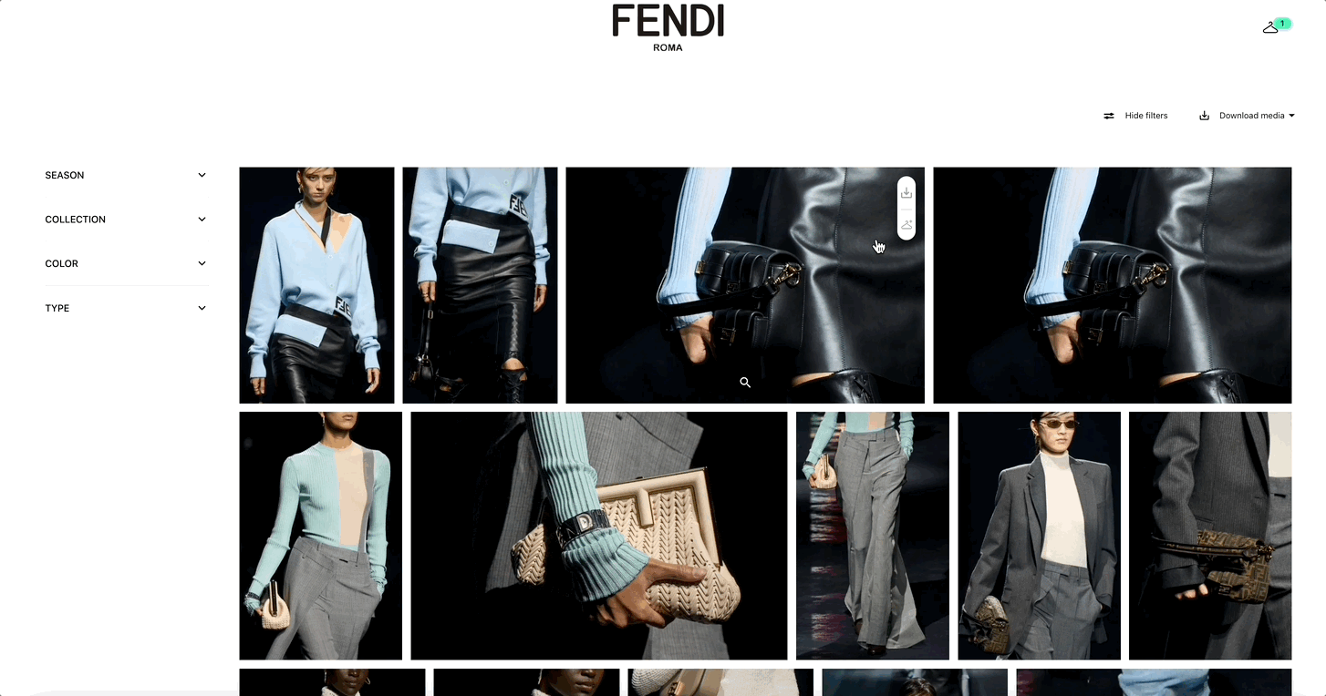
- Download media: this allows viewers to download the media of your Showroom, either in original full size (for print, for example), or in HD Screen quality (optimized for web pages)
- Download Press Release: Add PDF documents to your showroom. You can add up to 6 PDFs, and for now the maximum allowed size is 20MB, but this can be changed if it poses a problem. Your guests will now be able to download the whole Press Kit from the download menu in the showroom, or preview individual documents and download them from within the footer. These PDFs are stored at the showroom level, not at the section level, and therefore they cannot be "assigned" to a specific section
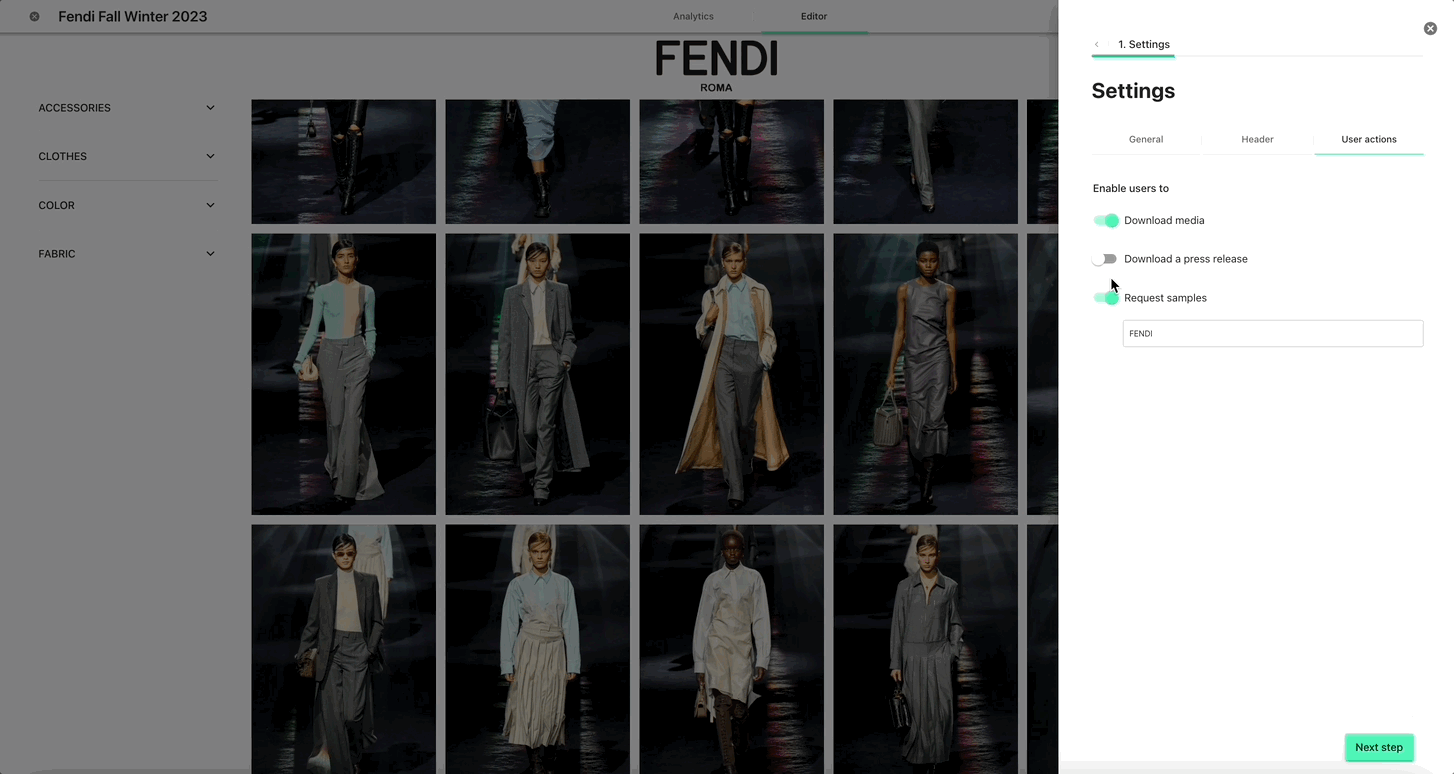
- Request Samples: If you have Samples by Launchmetrics, you can connect it to Galleries, import the samples to your library, add them to the showroom and then enable to users to request the samples visible in the showroom. With this option enabled, the users will see the following:
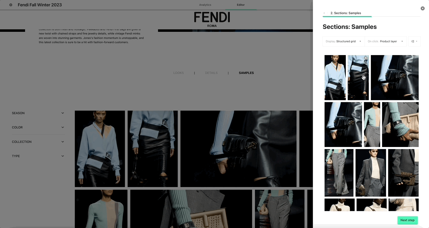
Step 2: Sections
2(a) Create Sections
Now that you’ve initialised the settings of your Showroom, it’s time to create its core: the sections & the media that will be stored in them.
Click on “Next Step” at the bottom of the panel, and create your first sections. You can create as few or as many as you like, and you can rearrange them by dragging & dropping them.
Note: if you only create one section, then its title will not be displayed at the top of the Showroom, you will see the media list directly.
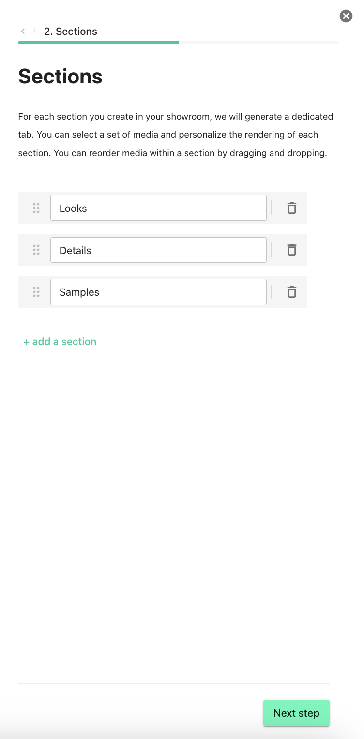
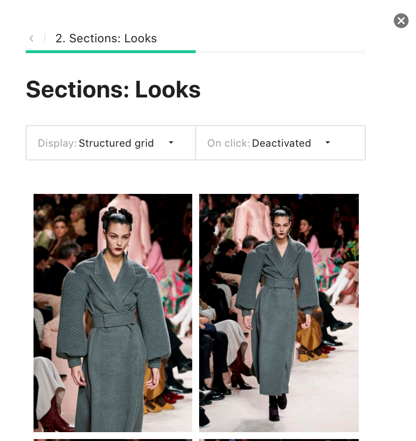
At this point, when you click on Next Step, you will dive into the first section (in our example, we will customize the 'Looks' section first). This is where you’ll select media and customize this section’s layout. You will go through this process for each section.
2(b) Select Media for each section
Let’s dive into the 'Looks' section, and add media to it.
Once you click on Next Step, you are in the details of the 'Looks' section, where you are prompted to 'Add Media'.
Then your Library popup appears. It is pre-opened to the right season and collection depending on what you chose in the header of your Showroom settings.
Here, you can either select media that you’ve already uploaded into your Library:
Or, you can upload your media directly into the Showroom. In either case, once you’ve clicked on 'Add to this section', the images appear in your panel, and you can drag & drop them to rearrange their order.
2(c) Customize the layout and detail layers for each section
Now you can change how the media are organized and how they behave if you click on them, using the two dropdown menus at the top of the panel:
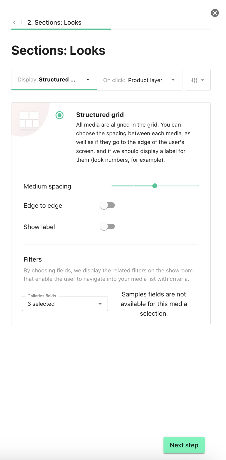
Display Options. These options allow you to change the way your section will look to your visitors. It is one of the key ways to make your Showroom look unique, and truly reflect your vision.
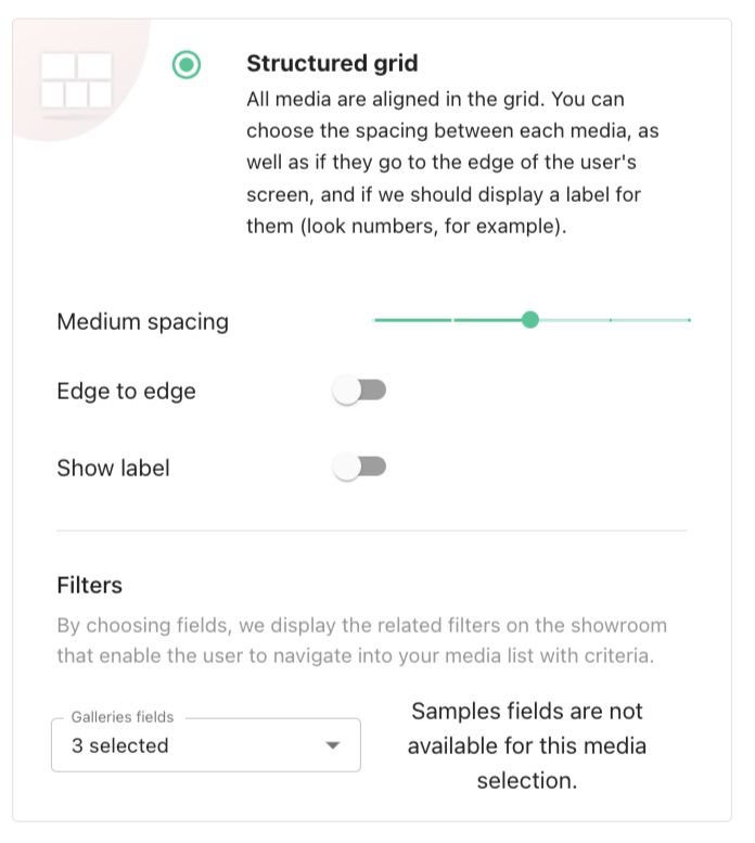
- Structured Grid: Use this grid type for large 'fullscreen' inspirational images, as well as for small media that need to be viewed in order (e.g. Lookbooks). In this grid type, media will be displayed next to each other in a highly structured manner. This is the grid type we have been using in the previous step.
Here, you have several options:
- Spacing: choose the space between each media, this creates 'air' in your showroom
- Edge to edge: selecting this means the media grid will stretch to the edge of your guests' displays, which is useful for full-screen inspirational images.
- Show label: selecting this option will display the name of your media. This will display the filename of the media, so be careful with the name you give them. This will allow you to display look numbers, for example.
Option:
You can change your layout (number of images per line and their order) at any time by clicking on the associated button at the top right of a section. This will apply to all images in a section at once.
Examples of layouts:
- Small size images, large spacing, with a label (look number):
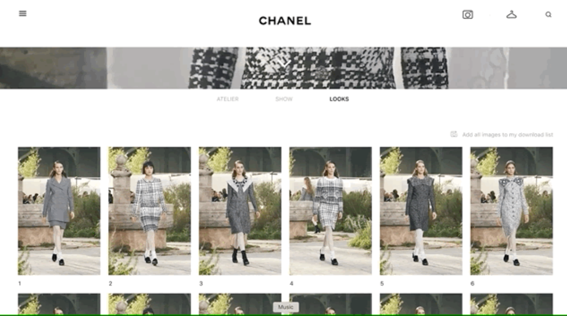
- Medium Size images, medium spacing, and with labels (look name):
- Large Screen size images, medium spacing, no labels (to inspire your audience on the collection’s feel):
- Full-screen size images, small spacing, no labels (to inspire your audience on the universe surrounding the collection):
NOTE: depending on the grid size you choose, this might create “holes” in your media rows depending on the order and the number of horizontal/vertical media that you want to display next to each other. We will display this to you in the media preview, and allow you to reorder/fill in the gaps as needed.
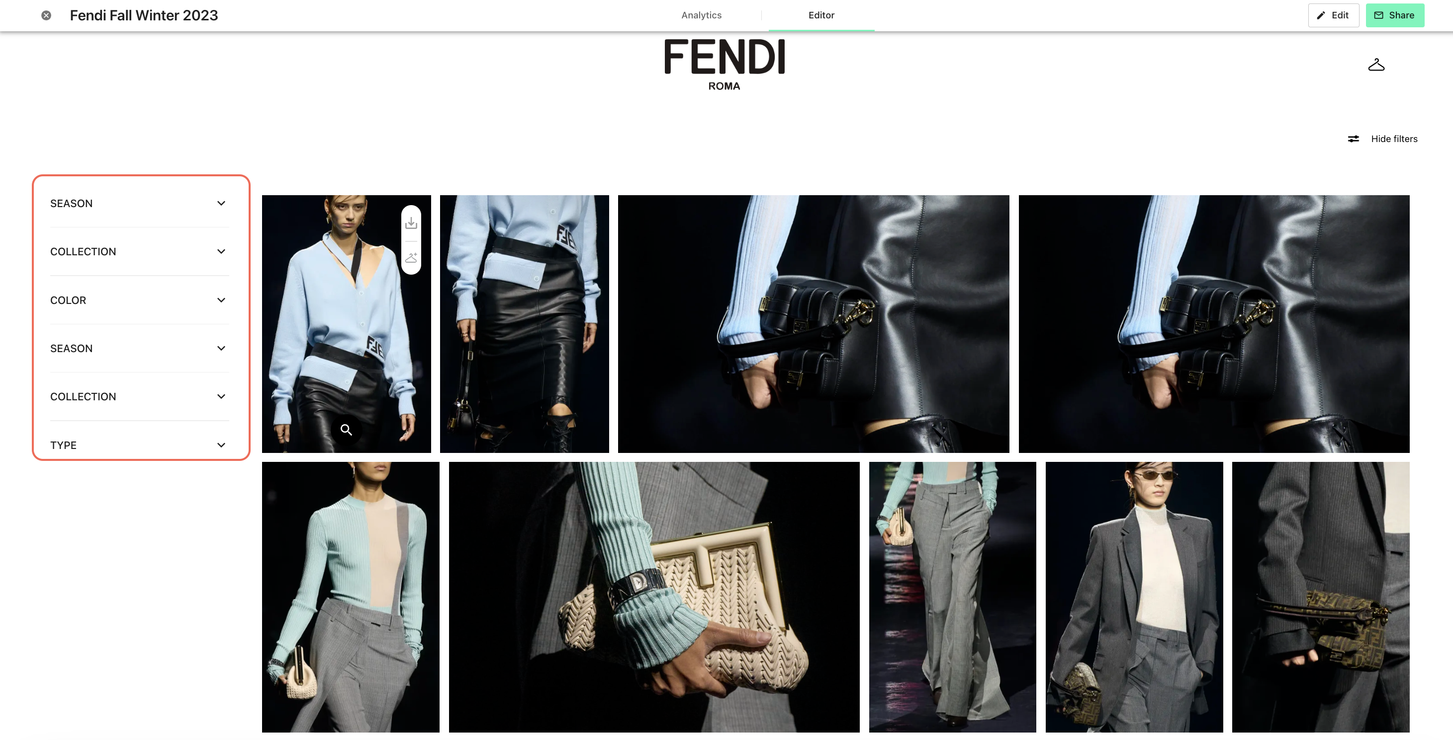
2(d) Add filters for each section
You can add filters that will be available in each of the sections. Here we are looking at the example from the third section (i.e. "Samples").
- Galleries fields: Filters that will be applicable only to "simple" images (not samples). The filtering options will depend on the tagging available for each of the images.
- Samples fields: Filters that will be applicable to the images marked as "sample" i.e. the ones that were imported from Samples. The filters depend on the tags directly imported from the product layer in Samples and do not depend on tagging in Galleries.
If there is no tag related to the given attribute, it will not be displayed in the filter dropdown. The default attribute list included in the filters for Galleries fields is: 'Brand, Season, Collection, Product Type, Color, Fabric', while for samples fields is: 'Season, Collection, Sample Type, Color, Pattern, Fabric, Size' . This means that even with exhaustive tagging, the filtering is available only for the attributes mentioned in the list.
If the user has no samples in their showroom (or when the specific section has no samples), the samples fields will simply not be shown as in the example below:
If a given section has both samples and other images, it is possible to display the filters for both and they will appear in the panel on the side all together. Note that there might be attributes that apply to both samples and simple images and that are named the same (e.g. collection, season). In this case the names will be duplicated, therefore it is the best to separate samples and include them in a separate section, displaying only the filters related to samples.
2(e) On click options
Here you can decide what happens as the user clicks on an image or a video. This is very important if you have look books with several images and/or videos per look, or if you want to display detailed product information.
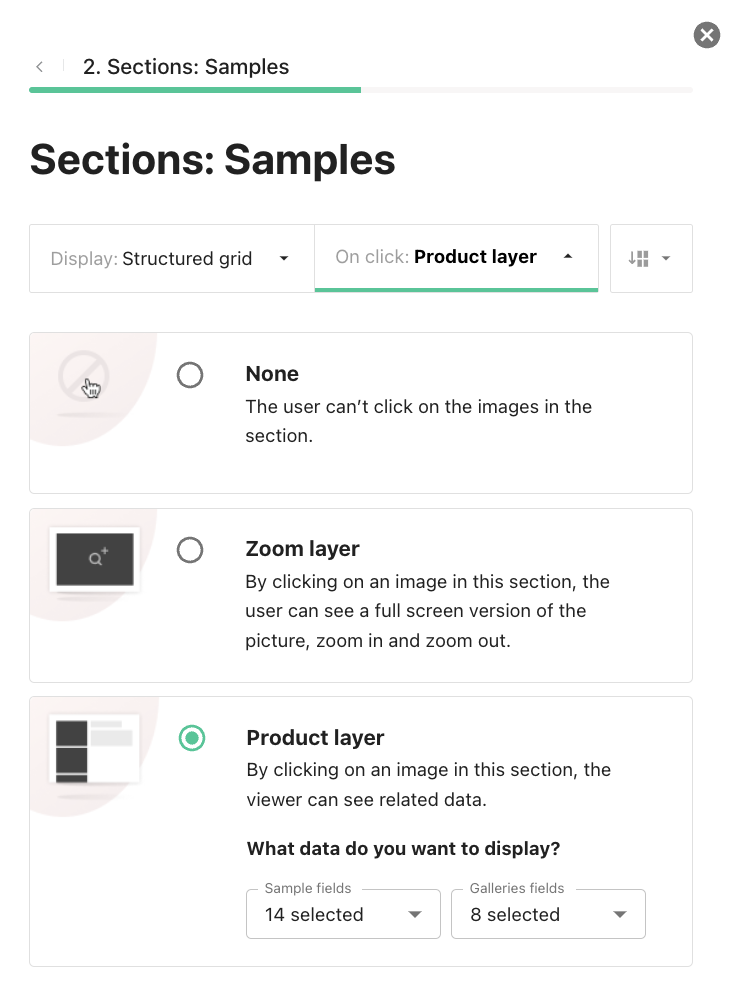
'None' means the media are un-clickable. For purely inspirational Showrooms. If you want this Showroom to be more of a “show & tell” kind, without the user downloading.
'Zoom' is if you want the user to be able to access a fully zoomed version of the media, and navigate through the media by using their arrow keys.
'Product layer' allows the users to see information about the chosen media. You can choose which information should be displayed.
Step 3: Add a Hero Image or Video
Next, you can optionally add a hero banner (image) and a text block at the top of your showroom. This will appear everywhere in your showroom. You may uncheck these checkboxes if you do not wish to display a hero.
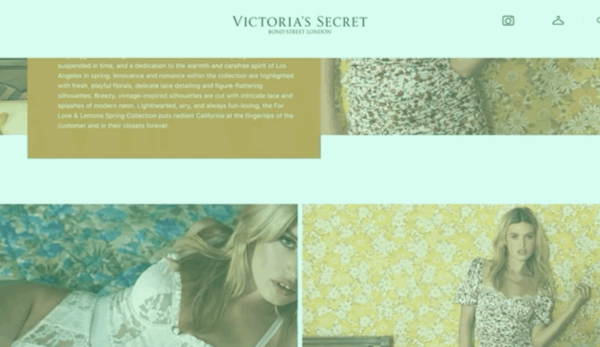
This Hero banner gives life to your Showroom and allows you to share the vision of your collection through an introductory text. It will be displayed at the top of your Showroom, all the time.
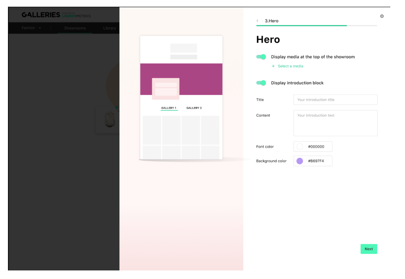
Media: you can choose a horizontal image or a video which will be looped continuously.
Introduction block: You can choose the font color and the background color to match your Brand’s aesthetics. The text can be as long as you like.
You can display one or both of these independently.
Example:
Step 4: Preview & edit your Showroom
Finally, once your footer links are set, click on 'See my Showroom'. You will be taken to a page where you can preview your Showroom, see what it looks like, and edit individual parts of it if you need to, before sending it to your audience. You can interact with it, navigating the different sections, in order to get a good idea of how they will behave.
Step 5: Showcase your content
Click on the share button at the top right of the Showroom preview, and you will be able to copy and paste the link to share it with whoever you wish.
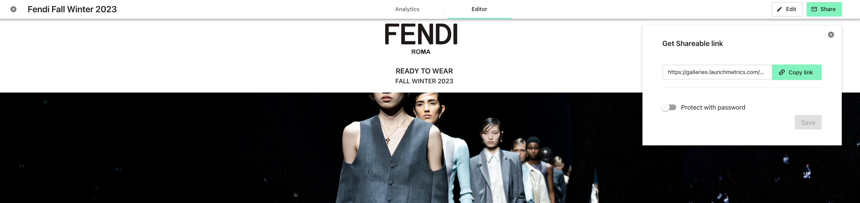
This link is unique to your Showroom but shared by all its visitors. So you do not need to worry about personalising the link to each person in your campaign. Do not worry, though, the link is private, and will not appear on Google search results. If you want more privacy, however, read on.
Delight your audience on desktop and mobile
Visitors who reach your Showroom will now be able to browse through it, look at each section, and download media directly from your Showroom on mobile and desktop.
Step 6: Repeat as necessary
You can create as many Showrooms as you like, they will all appear in the Showrooms tab of your interface. For example, you could create a specific Showroom for each market (France, Italy, USA, etc.), with different layouts according to what you know of that market’s tastes. You can even change the images for each market, as you are creating a new Showroom altogether.